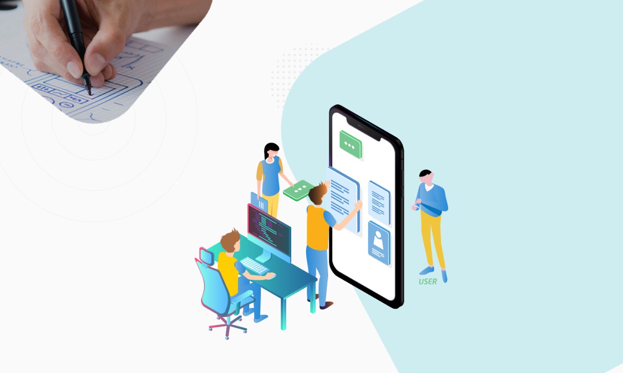
Are you looking to design your app or Are you a mobile app developer and are you working to make a mobile app? Are you currently creating the user interface of your application? Here are a series of tips that could make you comfortable!
What differentiates two or more apps that target the same user base is the User Experience (UX), which is the set of sensations experienced during the use of an application. To guarantee a good UX, you need to start from the development of the User Interface (UI).
The user interface is the means by which users interact and communicate with the application. It is composed of a series of textual and graphic elements, which allow navigation between the sections of the app. So this is not a simple layout, but it is also designed according to the feedback of the actions taken by the user.
Many novice developers are often faced with difficulties related to the design of a user interface that is attractive, simple to use, and functional. To this end we offer you some suggestions to help you in your work!
Tips for Making a Market-Proof Mobile App
In the preliminary phase of developing an application, it is very important to analyze the UI of those who are competitors already on the market (obviously if there are!), Listing the distinctive features of your application that can generate a competitive advantage. This step is crucial because the risk of ending up in the application-surrogate limbo is very high. This analysis allows us to obtain a greater awareness of what users expect in terms of user experience. It is therefore not advisable to start from scratch, without having analyzed the dominant formats (or models) in the world of mobile apps.
1. Choose how many sections the app will have
When you are preparing to make an app, once you have defined all the functions contained in the application itself, it is advisable to design the number of sections that will need to be created, counting the number of steps or actions that each individual user’s intention requires to be brought. For example, it is advisable to try to make the application’s core service reachable from the first screen. Even when the app has many features, it is necessary to give greater and immediate prominence to the main functions, while the more advanced options can be made reachable with a greater number of steps. Choose the type of layout that best suits your app.
There are 3 main types of layout:
- Linear Layout. Formed by elements arranged in a single direction, therefore vertically (vertical orientation) or horizontally (horizontal orientation);
- Table Layout. The elements are enclosed within rows and columns of a table;
- Relative Layout. The distribution of the elements is much less rigid, as is the navigation, and the layout is dynamic, able to change according to the screen size.
In general, the three types of layout do not preclude any functionality, but choosing one over the other can improve the user experience of some applications. In this sense, to make an app, the relative layout is particularly advisable, because it allows a rather harmonious adaptation on even very different screens and the elements seem less constrained within predetermined schemes.
2. Do you want to make a functional app? Don’t always think about menus and sub-menus
As previously mentioned, it is important to be able to make accessible the main function for which the application was created from the first screen. To do this, you can call up the menu using a special button later, without necessarily occupying an entire screen. Obviously, this as well as other tips depends on the nature of your application. A fitness application requires the user to choose from the menu among a certain variety of workouts, challenges, and tutorials according to their needs, while in a weather forecast application it is appropriate that the short-term forecasts are shown immediately the location where the user is located and that the search for other locations can be done with a special command.
3. Use the action bar to make an app!
The Action Bar is a rectangular band that is located in the upper part of the user interface and contains some quick access functions. Inside the Action Bar, there are interaction and navigation options that the user may wish to access on any screen of the application. The contents of this bar are usually the icon and/or the name of the application (which here have the mere task of a title), two actions such as “search” and “access”, and the Action Overflow, which allows you to access quickly to other items not present on the Action Bar.
4. Choose your design language carefully, to make an app at its best
Scheumorphism was the design language used in the user interface of the first iPhone models. The philosophy behind it was to recreate materials, reflections of light, and colors of real objects in a vintage key. Modern UI Design was created by Microsoft and is based on the use of bright and saturated colors. Objects are represented through 2D icons and any attempt to represent the real world is abandoned. Flat Design is based on two-dimensional minimalism, composed of simple shapes and flat colors, enriched by shadows that refer to three-dimensionality.
Also Read: How to Hire an Expert Team of Dedicated Developers?
There are different design languages that are methods for conceiving words, images, and signs according to a precise philosophy at the base. A language that has established itself in recent years thanks to its innovative ability is Material Design, created by Google and designed to reconcile the classic principles of good design, based on physical materials, with new technological innovations. This language aims to overcome the traditional Flat Design, the Metro Design of Microsoft, and the Scheumorphism typical of the first iPhones.
The Brand Manual of Material Design is a punctual and complete synthesis of the results of scientific research on the perception of colors, on the use of dynamic elements to keep the threshold of user attention high and on the application of typographical principles to show the hierarchies between elements (such as the use bold, color contrasts and shadows). The final effect of the application of Material Design is an interface that recalls the properties of paper and the natural use of lights and shadows. To actually see the application of this design language, you just open any app Package G Suite of Google.
5. Use grids and key lines to define the layout
The layout, to maintain visual consistency in all sections of the app, must be based on grids and key lines. The grids allow precise and constant spacing between the elements and between them and the edges of the screen. The key lines allow a distinction between different groups of elements and tools.
6. To make an app, plan your navigation well
The next stage is the design of the navigation. By navigation, we mean the set of movements that the user makes between the app screens to complete a certain action. Navigation follows three directions:
- Lateral, when scrolling elements of the same hierarchical level (for example the elements of a menu);
- Vertical, when accessing the elements of a larger group (for example when opening a folder containing files);
- Inverse, when you go back to the chronologically performed navigation.
7. The reference theme
When moving to the real user interface design process, you need to choose a reference theme. The theme, whether produced by third parties or by yourself, involves the use of the same range of colors, the same fonts and the same size ratio between the elements of each section. In short, it is the application of the same style to each screen. Without a theme, it would be difficult to make the user experience while using the app coherent from a visual point of view and each section would seem unrelated to the others.
8. Use the colors of your brand (or those of your customer)
To make the brand recognizable, it is very useful to use a theme with colors that refer to those of the brand. If the brand does not have a logo with particularly harmonious colors or in any case unsuitable for a mobile application, it is advisable to put the logo at the bottom of the screens, or even only on the main screen. The important thing is that the user recognizes the brand without being too intrusive!
9. Remember that colors have a meaning
There are some colors that have a universally understandable meaning. One of these is red, which allows you to easily highlight error messages, just as green is used to indicate the correct functioning of a function. The recall of a certain color to indicate a function or feedback is very important because the user is used to associating a color with a positive or negative event. Another very intuitive example is that of the yellow or orange color, which usually indicates an unfinished process.
Each of these tips has been designed for a generic application and may not be universally valid. Therefore the user interfaces of some particular applications require additional effort to function at their best!


