We are living in times when technology is blooming. Today each one of us highly depends on these technological evolvements that have added a lot of efficiency and convenience to our lives. Be it Business Intelligence, Artificial Intelligence, Blockchain, Augmented Reality, Virtual Reality, these have become an integral part of our everyday lives, without us even realizing the extent of their impact.
Talking technically, all of these smart technologies use complex algorithms in order to quickly analyze loads of data and then present the users with crucial information. However, if users are able to understand and relate it, then there is not any point of information or data. Like, if the users fail to see it as useful or are not benefitting from it then it is of no use at all. Owing to this very reason, today the dashboard designs are gaining immense importance.
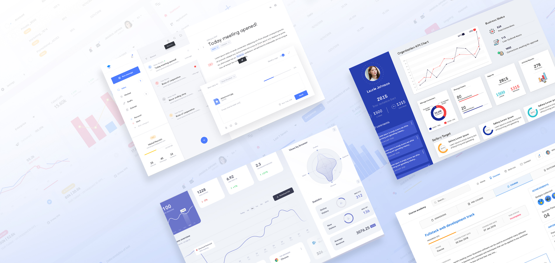
In this blog, we will be discussing the importance of the visual design of the dashboard, after all the User Interface of a dashboard is imperative in order to make it useful and fun. But before that let’s understand what makes a great dashboard.
Characteristics of a good dashboard:
- It shows crucial information that a user is able to act upon and it makes a visual representation of otherwise is complex data, easily understandable.
- It is useful in helping its users understand, analyze and present the key insights.
- A good dashboard is easily customizable; it is not convoluted and is extremely intuitive.
- Despite there being a limit on the space, a good dashboard facilitates most integral data component & widgets without appearing cluttered.
What is a dashboard?
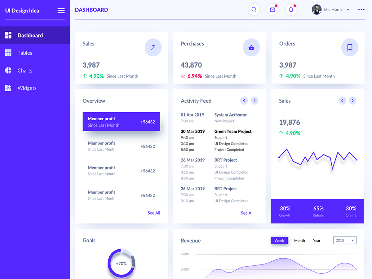
A dashboard basically is a screen in your app that displays the information. Usually, dashboards providers a global overview to the user, with access to most crucial functions, data, and controls. Often, a dashboard becomes a kind of homepage, mainly for the power users.
Getting a basic understanding of Dashboard Design
Dashboard design is most requested for nowadays, where businesses mainly dream for a simple view for presenting all of the information, showing trends, risky areas and keep them updated about the happenings. The dashboard is an “at-a-glance” preview of the crucial information useful for a user when he is having a look at it, and it is an easy way to directly navigate to various areas of application requiring the users’ attention.
In terms of its designing, it can be daunting to design a good dashboard; however, if kept the best dashboard design practices in mind, then it can be quite easy as well. So let’s explore them here in this article.
- Usage of consistent design language & color scheme: Even though the dashboard consists of data views, but that doesn’t mean that they can’t look striking. The key here is to keep things simple, airy and light, with wide usage of color schemes.
- Usage of different views: Dashboards that use different views are best because they allow keeping the main view simple, where users are able to filter data by data, access data and other information and external providers while maintaining this simple and clean look. Having all of this information in just one screen can do wonders.
- Usage of information architecture: While designing the dashboard, keep in mind the key fundamentals of the information architecture & hierarchy while deciding on which cards to show and in what positions. Utilize F & Z patterns that reflect how a user’s eye scans a page. Now apply that very logic to structure and order of the elements on the dashboard. Now lead with the must-have takeaway and let dashboard flow from thereon. Even though elements are crucial but some of the cards are more crucial than the rest.
- It is always a good idea for dashboards to lead with key data: The idea of the great dashboard if they cut out the bunk and lead with the big and bold numbers. This kind of dashboard is what a user desires for as it communicates decisiveness and confidence. For a good dashboard, the style should be on-trend with clean and modern design, with lots of white spaces and bold, clear takeaway data. When the data is presented in this manner, it allows the user to see what is important is a moment and this way it does the job of a dashboard, i.e. saving user’s time.
- Responsive Dashboard is the key: Thing about dashboards with a responsive design is that they allow users to decide what data they would want to focus on. For a good responsive design, it needs clear and easily understood user interface (UI) that enables the user to exact control which data is required to be front & center in the dashboard.
- Convey a story with your dashboard: Dashboards are useful to show crucial information at one glance, thus it is best to have all tiles on the one screen. Also, see if you can avoid the scroll bars on the dashboard. See if it is too cluttered, if yes, then remove things except for crucial and essential information that is easily read & interpreted.
- Clutter is best avoided: As you begin creating the dashboards, often we end up putting in too many applicable graphs and charts. Steer clear from this trap. The idea here is removing as much as possible and ensures that the end-user is getting the right insight from the dashboard. It tends to be an iterative procedure as you only come across the better version with time. Have a look at the latest dashboard created by you: see if it has a lot on it? Can anything be removed or rearranged in order to add more clarity?
- Take inspiration from other’s work: Taking the influence of the work of others is what works best when it comes to designing the dashboards. Like, as you come across a great and impressive visualization, then examine it well, and see if your work can benefit from any of its aspects.
- Understand the requirements of your users from the dashboard: For this, you would first require to know your audience. Now once you know your users and their personas, you would easily know about their expectations from your dashboard. For this, it is advised that you consider the five takeaways that your users would want to see in the dashboard, and then apply F and Z reading pattern, and accordingly structure the page.
Keep this fact in mind that ultimately dashboard is an overview, it is this single place from where one can monitor the current state of data. It is based on the underlying datasets and reports, and these consist of lots of details. The readers can get into reports from the dashboard, thus avoid putting the detail on the dashboard unless you want your readers to monitor that.

Next, it comes to where the dashboard will be displayed. In case it is displayed on a large screen, then more content can be put to it. In case the readers view it on tablets, then fewer tiles are advised that makes it more readable.
- Usage of grid layout: As you place objects on a dashboard (titles, filters, view, etc.), it is best to go with a grid format. What grid does is it helps in providing reading order for the dashboard and allows users to guide themselves all through the dashboard in way more logical and predictable manner. In order to create a narrative that leads the users from the overview to detail, use column or row-based flow.
- Usage of right fonts: Even though typography is essential, but often it gets tempting to use a lot many font sizes and types in a dashboard. Overdoing that. It is better to define a clear hierarchy as it comes to the typography. Reduce the hierarchy levels to ‘most essential’ as that removes confusion for users and keep in mind that ‘color’ can be the best way to allure viewers.
- Simplifying color usage: It can be really tempting to play with colors while creating a dashboard, but the best advice ever is to play safe, because unnecessary colors don’t add value. It is important that you can justify every color on the dashboard: like why you chose a particular color, and what it communicates to the user? In case you fail to answer this question, then it is best to remove that color. Also, a study reveals that 8 percent of the makes have CVD, which stands for color-vision deficiency, so choose color palettes that universally work well. For that avoid reds & greens, or choose red and green color even people with CVD can see well.
- Collaborate and repeat: Keep this universal fact in mind that for the first time, no dashboard is right. Only with time and collaboration, it is possible to represent your data in the best manner. After all, one can gain a lot from the experiences of other people, as it brings in fresh perspectives. Next, iterations if the key. Dashboards have to go through several iterations as they need to constantly improve and adapt to the changing business demands.
This is the guide that can be immensely helpful on your ride to create and design an amazing dashboard.